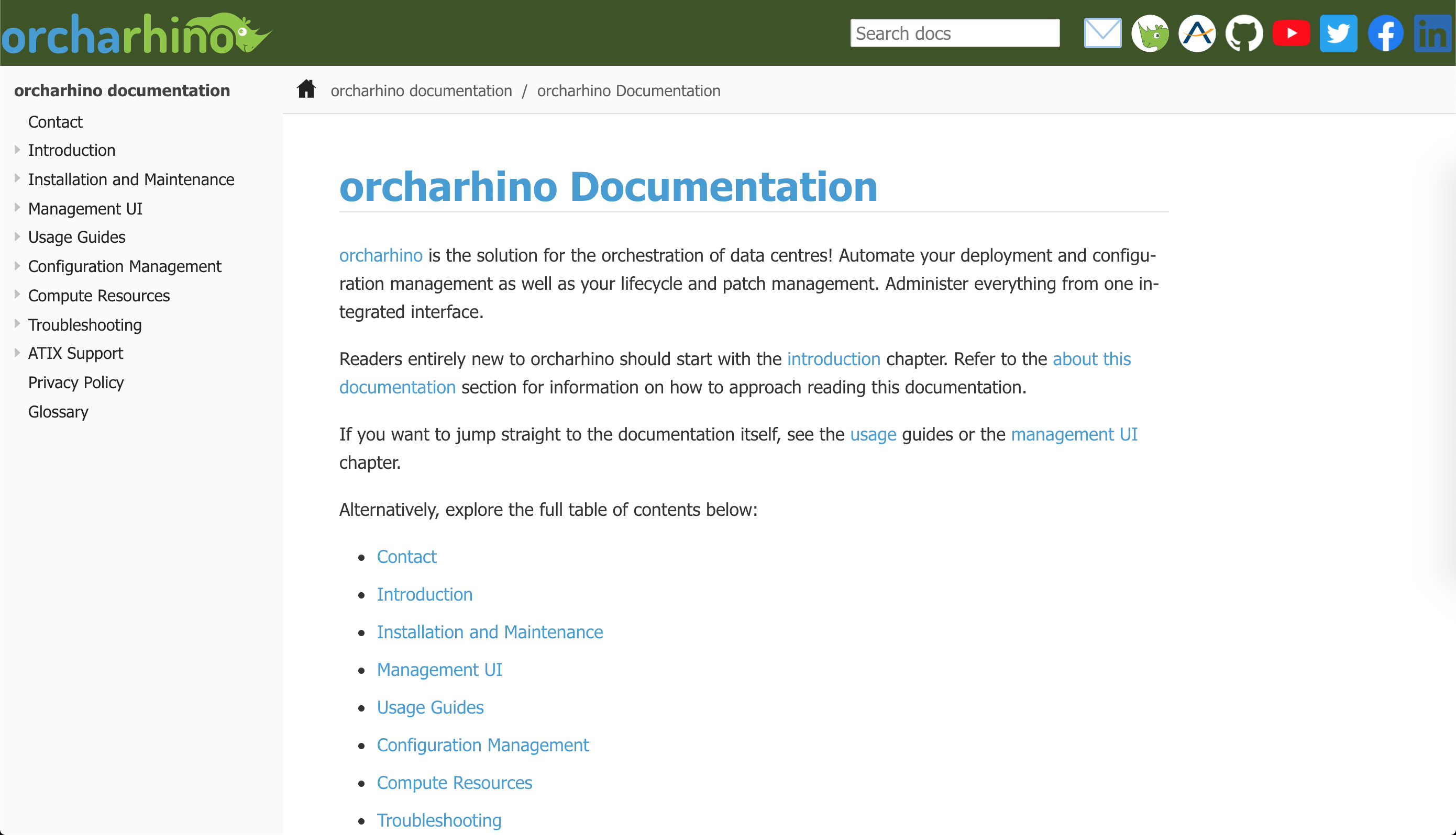
orcharhino 5.6 comes with an all-new documentation system
For the last couple of months, we were working on bringing you our trusted orcharhino documentation in a new look.
But do not worry, the content and navigation stayed the same, so you will feel right at home.
Our new orcharhino documentation internals:
- all new Gitlab pipeline to
lint,test,build,deploy, andpackagethe documentation (stay tuned for another blog article series describing our Gitlab pipeline) - all new container images built specifically for each job in each stage
- all new option to incorporate guides from the upstream documentation (i.e. https://github.com/theforeman/foreman-documentation)
- all new internal structure on how to include the documentation when building orcharhino
There are two reasons why we undertook this substantial effort:
First, to deliver a better user experience with a new design to help you use orcharhino to its full potential.
Second, we want to share content and responsibility with the Foreman community.
This means that ATIX not only contributes code to open source projects (Foreman, Katello, and Pulp just to name a few) as before, but also to their respective documentation.
A large part of the upstream Foreman documentation has been contributed by Red Hat and is also part of their Red Hat Satellite documentation. This results in ‚asciidoc‘ being the given file format of the upstream documentation we need to adapt to.
Hence, our first challenge was to switch from restructured text and using Sphinx to build the documentation to ‚.adoc‘ and another toolchain to test and build the documentation.
We chose Antora to convert .adoc source files to .html output.
We will surely write a follow-up blog article series describing our changes and our new Gitlab pipeline.
We added lunr to provide a search function as this is not provided by Antora out of the box.
While the first step was mainly converting .rst to .adoc using Pandoc, the second big step was to polish Antora and its UI to make it more user friendly.
To give it a distinct orcharhino look and feel, we obviously chose the orcharhino green and blue as main colours and added different shades where necessary.
Later on, we also made use of asciidoc and Antora admonitions, i.e. note, important, and warning boxes whenever required.
One of the new features is the new side bar on the right, which shows any subheadings of the page.
This is especially helpful when reading large pages like the attach existing hosts guide or content hosts page.
orcharhino instances do no longer supply a .pdf version of the documentation.
We recommend either using the inbuilt documentation at orcharhino.example.com/or_doc or -even better- navigating to docs.orcharhino.com for the most up to date orcharhino documentation.
Last but not least, even though we have had to slightly change the deep links to the documentation (e.g. from https://docs.orcharhino.com/sources/contact.html to https://docs.orcharhino.com/or/docs/sources/contact.html, we will automatically redirect you in case you have any existing bookmarks.
We hope you enjoy reading the new documentation and it helps you better understand orcharhino with all its capabilities, functions, and options.

